I
Context
The brief
This project involved designing and developing a new website for Women in Clean Tech SFU, an organization focused on supporting women in sustainability and technology. The organization previously had an outdated website that was no longer actively used, creating a disconnect between their online presence and the professional, forward-thinking image they wanted to represent.
Independently, I created the entire project, from research and visual design to prototyping and final development in Framer.
The problem space
Before beginning the redesign, I conducted user testing to better understand how visitors interacted with the existing site. The majority of participants reported difficulty finding information and stated they would be unlikely to return. This revealed a clear problem: the organization lacked a cohesive, user-friendly digital space where members and visitors could easily access information about events, initiatives, and contact details. The redesign became an opportunity not only to modernize the site, but also to rebuild the experience around user needs.
II
Strategy
Approach
Utilizing Figma, I developed the site structure, layouts, and visual direction before translating the designs into a fully functional website in Framer. While the organization already had some existing branding elements, the visual identity felt inconsistent and did not fully communicate the clean, modern image associated with the tech industry. To address this, I refined the existing colour palette and selected a clean sans serif type to create a more cohesive and contemporary experience.
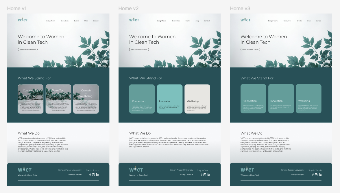
Home page iterations in Figma
"One of the biggest lessons from this project was understanding when to preserve existing branding and when to evolve it to better reflect the organization’s goals."
The design decisions
Beyond the visual identity, the strategy focused heavily on accessibility, clarity, and navigation. Using insights from user testing, I organized information into a structure that made events, organization details, and contact information easy to locate. Every aspect of the site was designed to create a professional and intuitive experience that reflected the organization’s values while improving usability for visitors.
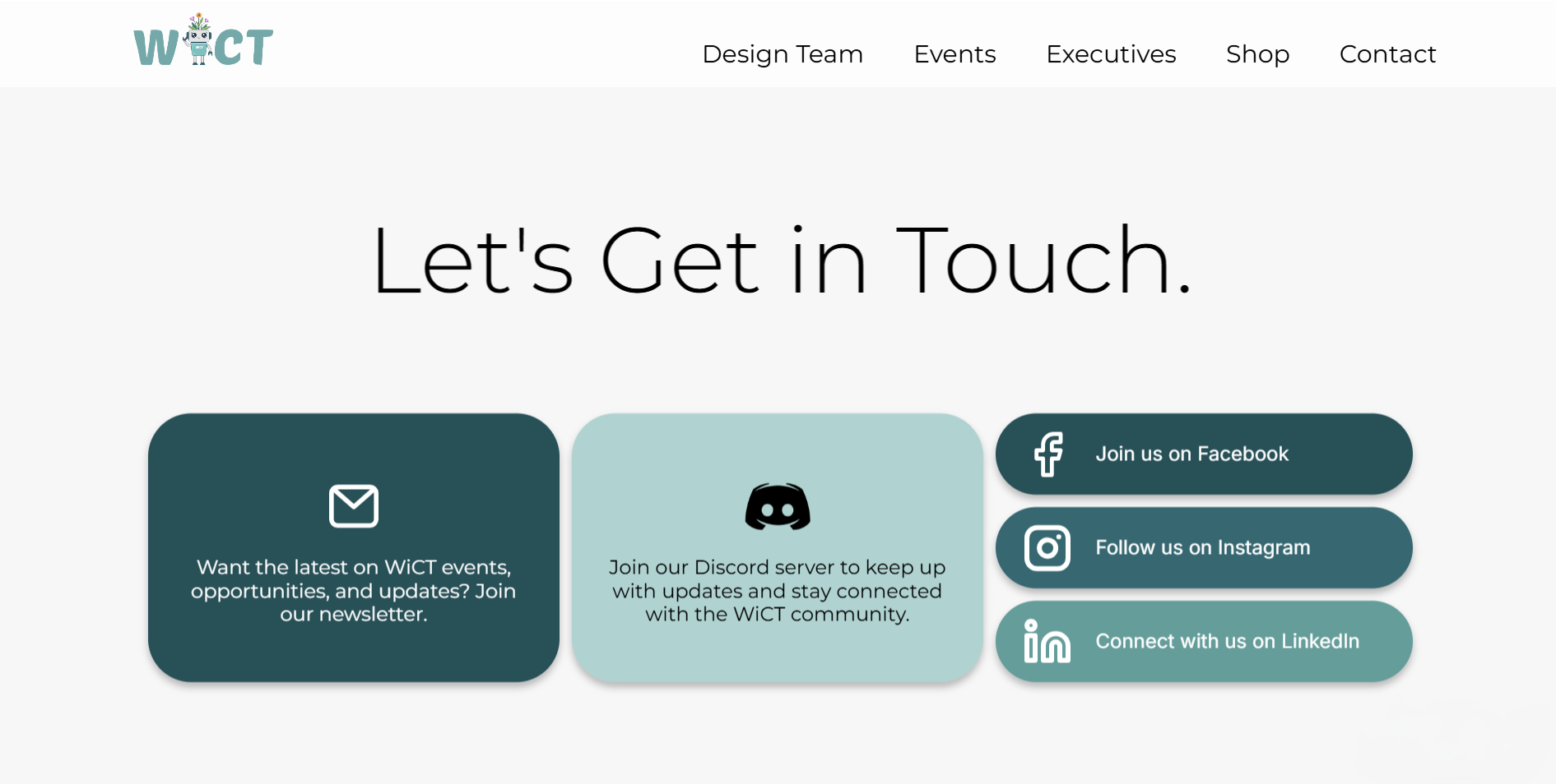
Contact page.
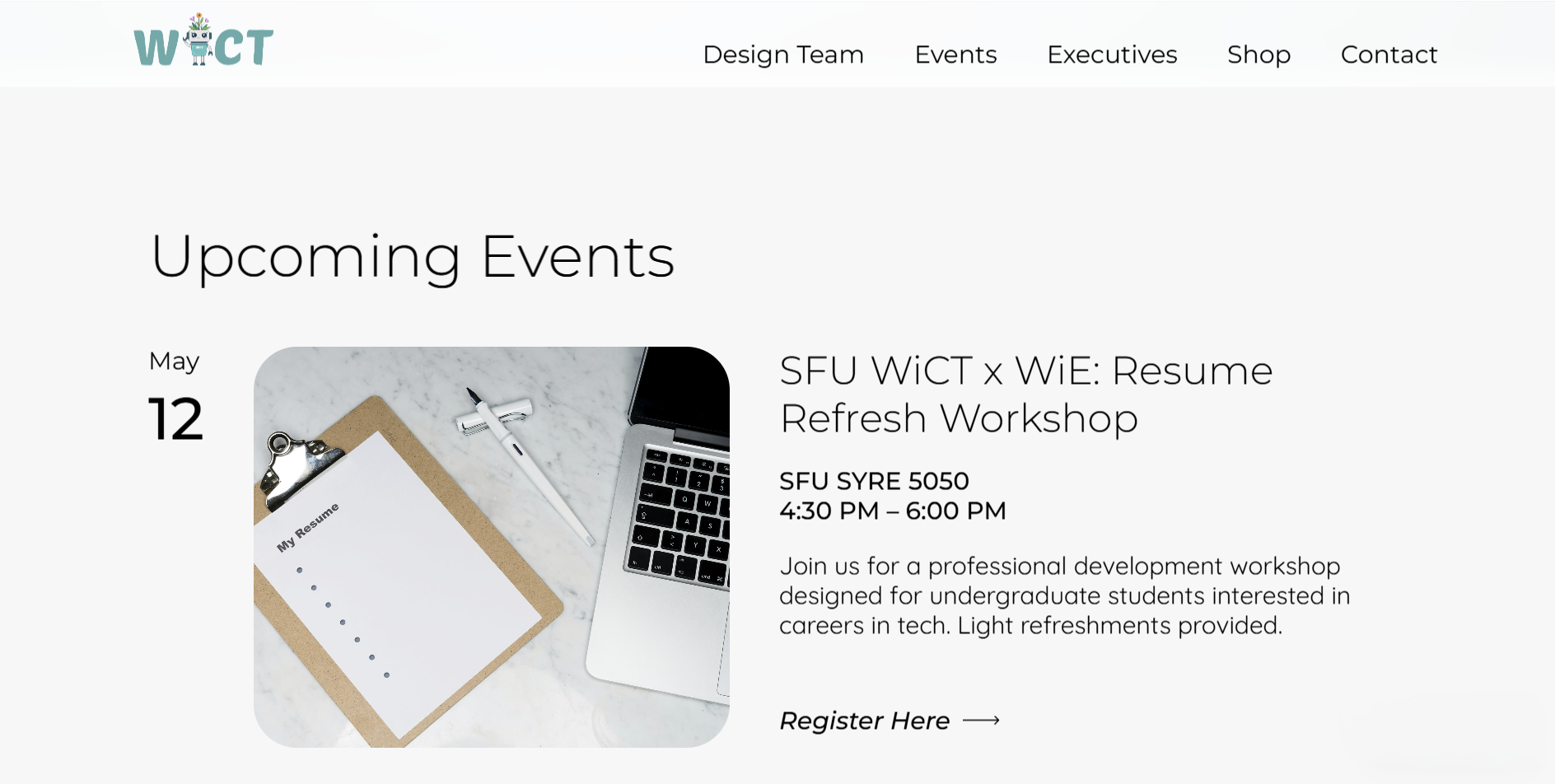
Events page.
III
Takeaways
What worked
This project strengthened my ability to translate an organization’s goals, values, and identity into a digital experience. What worked most successfully was the combination of research-driven design and a cohesive visual system, resulting in a platform that felt both modern and functional. After the redesign, follow-up testing showed significantly improved responses, with users finding information more easily and expressing greater interest in returning to the site. The executive team was also highly satisfied with the final result.
- 01 Improved User Engagement
- 02 Executive Team Satisfaction
- 03 Greater Visibility for the Organization
What I would do differently
Working independently across every stage of the project also reinforced my ability to manage an end-to-end design process, from research and concept development to implementation and iteration. If I were to continue developing the site, I would explore adding more interactive and community-focused features to further strengthen engagement and encourage ongoing participation within the organization. I would also translate this into HTML, CSS, and JavaScript for greater control over the site.